Problematic : Does colour have an impact on the perception of infrared images?
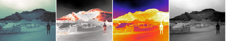
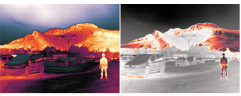
Colourisation is an optional step in infrared image processing. This false colourisation transforms a greyscale image into a colourised image with a palette of 256 colours called a colormap. The different colormaps presented in this post have been developed with several objectives in mind: improving visual comfort, highlighting the hottest objects, improving contrast in dark areas, etc.
Do these colormaps really have an impact on human perception? Do they make them easier to interpret?
Experiment 1:
To answer this question, we devised a perception experiment. The experiment takes place in a room where the ambient light and screen brightness are controlled. The participant is presented one by one with 150 pairs of infrared images. Each pair consists of the same image coloured in two different ways (i.e. coloured with two different colormaps). For each pair, participants were asked to choose the image they felt was most interpretable. A total of 92 people, including 53 experts, took part in the experiment.
The interface presented to the participant is as follows:
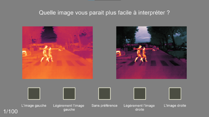
Points are awarded for each colormap depending on the candidate's answer:
- The participant chooses the ‘left image’: the left colormap wins 2 points and the right colormap loses 2 points.
- The participant chooses ‘slightly left image’: the left colormap gains 1 point and the right colormap loses 1 point.
- The candidate chooses ‘no preference’: no colormap gains or loses points.
Each candidate therefore assigns a score to each colormap, called the ‘real score’. This score varies between -2 and +2. A score of -2 means that this colormap has never been chosen by the candidate and a score of +2 means that it has always been chosen by the candidate. A score of 0 means that the colormap has been chosen every other time.
The scores obtained are shown in the figure below:
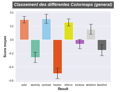
There are two groups of colormaps, those that have a positive score (i.e. have been chosen more than half of the time) :
Those with a negative score, meaning that they were least appreciated:
The most popular colormap is contrast, which has very sharp edges. The least popular is tracker, which is made up of a greyscale part and a coloured part.
Projecting the data in 2D, the colormap results show a clear division of the colormaps into 3 groups:
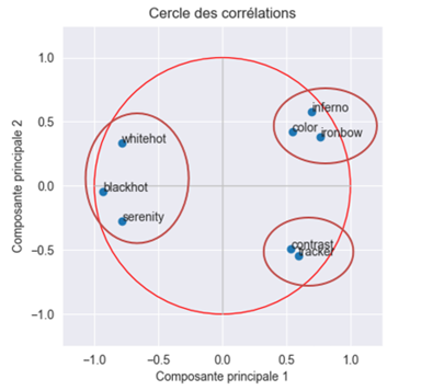
- Coloured colormaps: colour, inferno and ironbow
- Colormaps with little or no colour: whitehot, blackhot and serenity
- Two-part (two-colour) colormaps: contrast and tracker
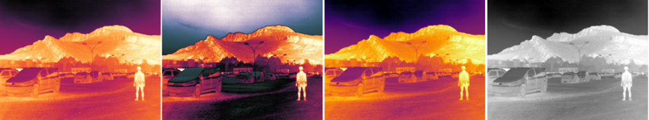
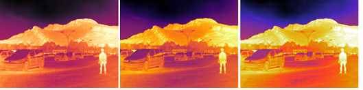
For the automotive application, it is the standard whitehot colormap (left) that is preferred, even though it was only 4th in the overall ranking. The least popular colormap is tracker (right).
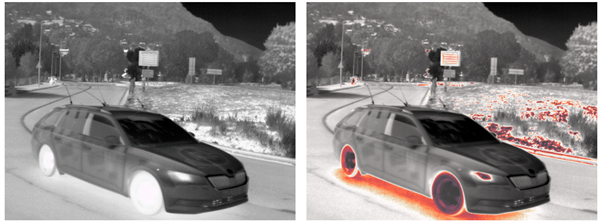
Compared to the general trend, the blackhot colormap is popular for automotive applications, for example:
This can be explained by the fact that the colours are closer to their true colours when visible, particularly white sky, grey road and white road markings.
Experiment 2:
A second experiment was set up to compare the colormaps in terms of performance. The participant was asked to find an object in the infrared image and their response time was measured, i.e. the time it took the participant to click on the object in question. Each image is presented only once to each participant to avoid the response time being affected by the participant's prior knowledge of the image. For this experiment, the number of participants was 67, including 28 experts.
The results are presented in the form of a graph of average times normalised by colormap.
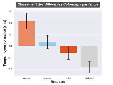
The graph can be read as follows:
- An average time normalised at 0 means that the colormap neither saves nor loses time when searching for an object. On average, therefore, it adds nothing.
- A positive normalised mean time means that the colormap wastes time searching for an object.
- A negative normalised mean time means that the colormap saves time when searching for an object.
The colormap tracker is the least efficient, losing 0.21sec in the search for an object. Whitehot performs best, finding an object 0.18sec faster on average. Color is the second best-performing colormap with a gain of 0.05sec and contrast loses 0.03sec.
The big difference in performance between whitehot and tracker can be explained in two ways:
- Participants are more accustomed to black and white images than to colourised images as with tracker.
- Tracker makes it difficult to interpret the image by altering contrasts and changing the ‘logic’ of the scene.
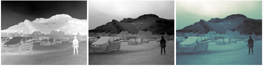
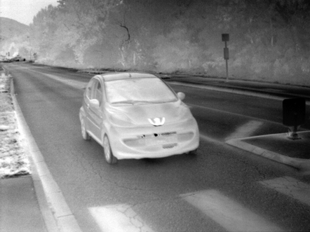
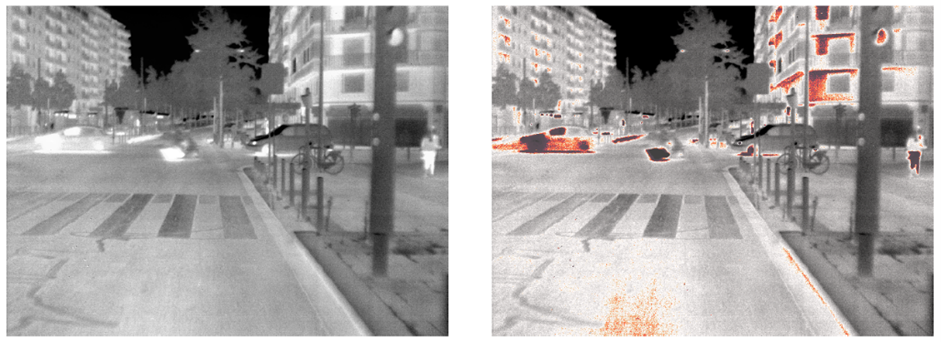
The following image shows an example for an automotive pedestrian detection application. The pedestrian on the right of the image is easily visible on whitehot (left) because the contrast between his legs and the background is high. On the image colourised with tracker (right), the contrast between the legs and the background is much lower. The pedestrian is also split in two because of the colormap, which makes detection even more difficult. In addition, many uninteresting areas are coloured red, drawing the eye away from the pedestrian. For a display to the driver of a vehicle equipped with a thermal imaging camera, we therefore prefer the whitehot colormap.
In conclusion, the colormap has a significant impact on how it is interpreted by the human eye. The preferred colormap is often the one that renders close to the visible. In the vast majority of cases, the colormap is preferred when the object of interest is bright against a dark background and its contours are marked. Colormap with a tracker is almost always the least popular. In the case of an automotive application, we prefer the whitehot colormap, which offers the best performance in terms of detecting vulnerable road users (pedestrians, cyclists, etc.). Other perception experiments will be carried out later to confirm these results, which can also be compared with the results obtained by an AI on the same images.
Authors : Group of three students from Polytech Grenoble – INP, UGA, M2 project, IESE stream
Key words: Colourisation, perception, image processing